Second stop is Branding working with Michael Ellis the Director at Marimo, (www.marimo.co), Myself and Mike met at Northumbria university both studying design courses. Mike is an experienced designer, art director and brand strategist. Trained as an industrial designer, he has developed brands for multi-national clients such as Lego, Lotus, Unilever, and the BBC. His team is made up of specialist freelance experts.
The Logo
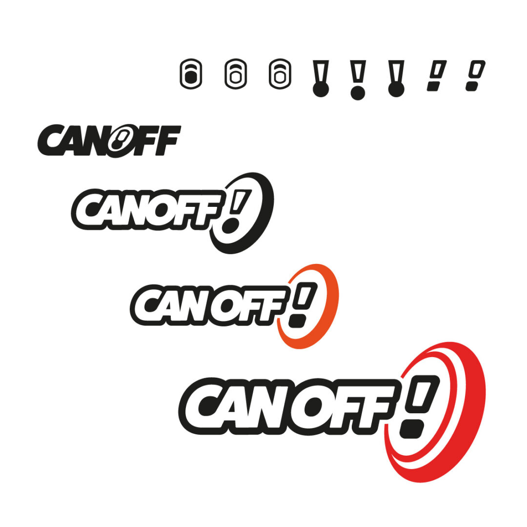
I wanted to create a logo style that hinted at American style sports with the use of an offset text stroke, many examples had text shadows or a perspective depth which was too fussy for my liking, so with the use of a subtle Italic slant gave it that extra depth and feeling of movement.
Canoff in development has gone from Cans, Canfly, Flycan, Canbash, and then back to Canoff, we set out with the idea of using the ‘O’ as the top of the can incorporating a subtle and clever type ring pull, a nice starting point but this wasn’t quite working an looked a little odd in it’s placement. The shape of the ring pull evolved naturally into something much more minimalistic and all of a sudden we had an exclamation mark!
Mike placed this at the end with an additional circle/oval on a slight angle to emphasise the top of a can, it was great, it gave that bold statement at the end ‘This is Canoff!’ it was nearly complete but we wanted to try incorporate the symbolic reference of the flying disc too, with a slight adjustment of splitting the ring gave it that extra depth whilst also representing the top edge rim of a can.
Colour Schemes
Canoff also went though 4 different colour schemes before landing on the Canoff aqua, I wanted something that felt it was uni-sex, not the stereotype blue for guys and pink for girls, the aqua bridges that gap and gives it a holiday feel to it, it reminds me of the sea, the beach and playing games. The ruby colour was introduced as a secondary colour, again not neither pink nor red.
A great start, I had a refined brand identity with logo variations, usage of the icon on its own along with a full brand guidelines document highlighting colour, typography and a guide to illustration style.